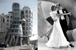
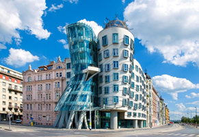
With the aim of creating an iconic building in Prague, Dutch Bank Nationale Netherlanden (formerly known as ING), commissioned architects Vlado Milunic and Frank O. Gehry to undertake innovative architectural projects. They were given a nearly limitless budget and unfettered creative liberties, which we can still see today.
The dancing house was designed in 1992, began its construction in 1994, and was completed in 1996. In this collaboration, a unique destructive building with plastic elements was born and at the same time harmonizing with the surrounding buildings. It is one of the few houses in Prague that firmly enters the space of the street. The building is also figuratively referred to as the Dancing house or Gingerbread and Fred. It was named after a tower reminiscent of the famous dancers Ginger Rogers and Fred Astaire. Fred is represented by the stone tower, to which a metal head is also included. The ginger is represented by the glass tower.
Due to its unusual shape, this style is called ‘deconstructivist architecture’. The "dancing" form is supported by 99 concrete panels, each of which has a different shape and size. The top of the building is a huge twisted metal structure, nicknamed "Mary". The male part of the dancing couple is portrayed by a rock tower, and the female is shown by a tower made of glass. The top of the men's tower is covered with real hair.
Czech-British architect Eva Jiricna did most of the interior design. The structure comprises nine stories and two underground levels. The distribution of each floor is varied due to the asymmetrical design of the building, resulting in asymmetrical interior rooms. The lobby and first level are where the building's commercial activities are conducted. The top six stories are primarily occupied by offices. Due to the slender shape of the building, the building is vertically divided into two parts, and office space is limited. To make the most of the space, the architect Jiř used common design elements on the ship and incorporated a small corridor into the building. The total area inside the building is 3,796 square meters.
The dancing house has two principal parts. The first is a glass tower, which is halved in height and is supported by arched columns; the second is parallel to the river and is characterized by wavy lines and skewed windows. This design was made mainly for aesthetic reasons- aligned windows will make the building two stories taller, even though it is the same height as the two adjacent 19th-century buildings. The windows have protruding frames, just like the frames in a painting, because the designer wants them to have a three-dimensional effect. The curved shape on the facade also helps to blur the perspective and reduce the contrast with the surrounding buildings.
There was also debate regarding the building's unique and unusual design, as well as the impression that the tower was skewed. The Dancing House, on the other hand, has proven to be a great architectural jewel in Prague, and it's difficult to find someone who doesn't like or at least accepts it today.


